Archive for the ‘Web Usability’ Category
Drive Conversions with Obvious Action Boxes, Buttons, Links
Friday, March 14th, 2008For the average small business website, particularly local businesses, your website often has only one goal, or maybe a few at most. Primarily it’s to drive visitors to initiate contact and become a sales lead. Using “Action Boxes”, buttons, even calls to action links can really help to drive your visitors to your intended site goal.
The vast majority of small business websites are not selling product or services directly online. They provide their services out in the off-line world while the website is simply a marketing vehicle. These types of websites should not just be a digital brochure that simply says “Hi, we do this. Give us a call at this number”. You need much more in order to drive those visitors to call, or send an email.
Here are some example’s from some of my clients sites;
Action Boxes & Buttons

Body Balance Massage and Day Spa in Springfield, Missouri uses its action box at the top of the right side bar to encourage visitors to book appointments directly through the website. The action box is very visible and the orange arrow really draws attention to the link. The eye is drawn there before visitors even read the main body of the page content.
Being that they are located outside of the city the website helps to pull their customers from within the city (local search optimization helps). Also the line “We’re only 15 minutes from Springfield” lets people know its worth while to take a short trip out of the city for a day at the spa.
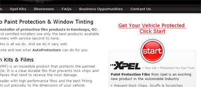
The “Start” button here on the autoprotectors.com website is extremely effective. It gets visitors searching for automotive paint protection kits for their particular vehicle. The website tends to attract more people looking for window tinting as the paint protection film (PPF) is a rather new product in the industry that not many know about or directly search for. The website is designed to showcase PPF and create more awareness of the product in their market area. Many people have told them that the first thing they want to do when landing on the site is click on the Start button.
Call to Action Links
Here we’re not using an action box or any buttons, perhaps during the next time we revamp the site we may, but we placed big bold “call to action” links after the first section of the home page content. We added another one at the bottom of the home page to catch those that have scrolled down that far.
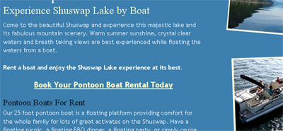
Instead of simply relying on the Contact button up in the navigation menu these call to action links, that simply link to the contact page, help to drive visitors to the contact page where many end up sending an email. Initiating contact about renting a boat on Shuswap Lake is the prime directive of the website. The site is very simple, no technical web applications, but it’s quite effective.
It’s All About Driving Conversions
These techniques are actually quite simple, even obvious. As most web users are quickly scanning pages for something to click on you simply have to give them something they can find easily and click on. It’s just a matter of taking a little time during the design phase to implement them and use the type of action box or button, or call to action links that are appropriate to the design and the business.
Make them big, make them stand out, and more web visitors will click and increase the chances of the site achieving its desired goal; converting web visitors into customers.
Speaking of conversions, how do you track web conversions when your small business website does not actually sell stuff directly online? I have a future post on that one coming up.
RSS Feed
The Topics
- I’m Such a Nerd - Now a Wine Nerd
- An Ode to a Very Special Little Rescue Dog
- Centering a Div in IE9 Using margin:auto
- Playing with HTML5 for First Time
- My Wife is a Food Blogger
- Designing and Coding a Mobile Version of your Website
- A CSS Sticky Footer that Works in 2009 (Chrome too) (343)
- New iGoogle with Left Nav Bar is the SUCK! (194)
- My Cool Ass CB750 Cafe Racer (115)
- Centering a Div in IE8 Using margin:auto (19)
- The State of Local Search in Canada (14)


Recent Stuff
